
The QUT Centre for Data Science has a Shiny server!
Shiny is an R package that makes it easy to build interactive web apps from R. You can host standalone apps on a webpage or embed them in R Markdown documents or build dashboards. You can also extend your Shiny apps with CSS themes, htmlwidgets, and JavaScript actions. See shiny.rstudio.com to learn more.
Interactive web-based apps can be a great way to promote your research and share results with partners. The server can host apps publicly or privately, requiring an email invite to view.
Create an app and win $100
We are holding a contest for the best student and non student shiny app! Two $100 gift cards are up for grabs!
All submissions are final.
Check out some of these apps created by our centre participants
How to Make a Bad Visualisation
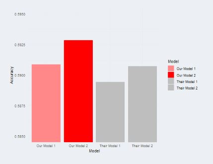
Created by Genevieve Richards, Samuel Smith and Jim Hogan
This interactive app is intended to demonstrate the ways that ineffective or misleading visualisations can be designed, whether accidentally or deliberately. The issues covered include the selection of colours and scales, the type of chart used, and the quantity of data displayed at once. The app gives information about the issues and lets the user experiment with the visualisations to better understand them.
Find out more about this app here.
Injury Treatment & Rehabilitation Accessibility Queensland Index (iTRAQI)
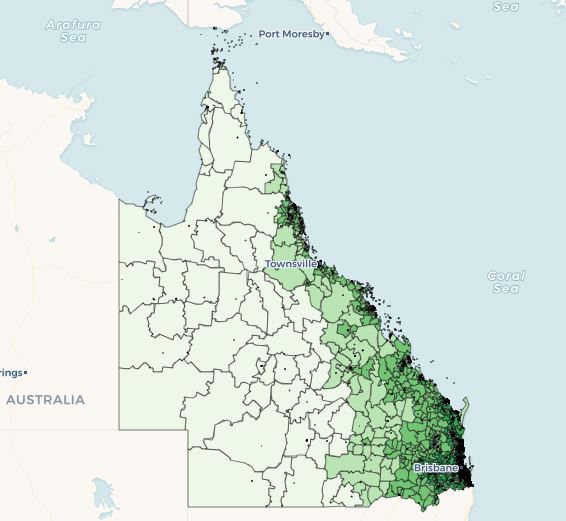
Created by Rex Parsons
The iTRAQI (injury Treatment & Rehabilitation Accessibility Queensland Index) app allows the user to visualise (in)equity of access to traumatic brain injury care across Queensland. We present both access to acute and rehabilitation care separately as well as the iTRAQI index which combines them.
Find out more about this app here.
Where are the vulnerable children? Identification and comparison of clusters of young children with health and developmental vulnerabilities across Queensland
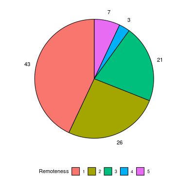
Created by Wala Areed
K-means analysis was conducted on data from the Australian Early Development Census and the Australian Bureau of Statistics for children development domains. Summary statistics for each cluster (size, mean, variance, range) for the five development domains and two indicators are visualised in the R Shiny application, the first tab, which shows the K-means cluster summary, the user can select the type of development vulnerability and the cluster of interest. The clusters, labelled C1, C2, C3 and C4, correspond to vulnerability level ordered from lowest vulnerability (C1) to highest vulnerability (C4). Furthermore, this first tab shows the associated characteristics related to the demographic factors for each cluster and the location of the SA2 areas on the map. The second tab shows a map of the distribution of the clusters (regions of differing vulnerability) for a given development vulnerability. The user can choose the type of development domain from the five domains and two indicators and can zoom in on the Queensland map to view finer details for each region.
Find out more about this app here.
Want to host your own apps?
Contact Gentry White for access to the server.