Figure A1 and A2 provide examples of dashboards for monitoring occupancy (discussed in section 4.1). Figure A1 illustrates an example of the hourly occupancy extracted from transaction data for zone 4000142 on February 12th, 2022. All three occupancy measures explained above have been shown on the diagram.
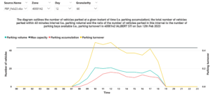
Figure A1: An example of the hourly occupancy extracted from transaction data
Figure A2 demonstrates an example of change tracking dashboards designed for monitoring occupancy. Parking managers can observe the changes in the measure over various months for a particular zone by selecting a specific measure such as parking accumulation. This is useful when investigating the impacts of altering on-street parking parameters, such as time limits or operational hours, on drivers’ behavior (Assemi et al., 2020).
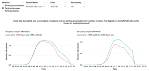
Figure A2: An example of change tracking dashboards
In section 4.1.2 we discussed the creation of scenario-based dashboards to assist parking managers in analysing the impact of temporary closures. Figure A3 provides a visual representation of the impact of temporary closures on three observed parking events (numbered 1 to 3 and shown in grey). The impact on these parking events is determined based on their relative positions to the closure period. We apply specific rules to adjust their start and finish times to accommodate the closure’s effects. The first parking event’s start time occurs before the beginning of the closure. To adapt to the closure, the duration of this event is shortened, and the new expiry time is set to match the closure’s start time. The start time of second parking event falls between the closure’s start time and the demand shift start time. As a result, it is completely removed from the list of parking events. The start time of third event is after the demand shift start time. In this case, it is adjusted by shifting it forward to commence at the closure’s finish time.
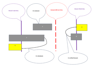
Figure A3: A visual representation of the impact of temporary closures on three observed parking events